Coffee Design: Ninety Three Million From Blanchard’s Coffee
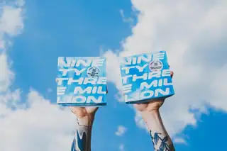
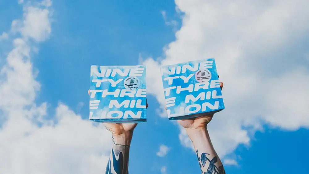
Blanchard’s Coffee has a new project underway called Ninety Three Million —and with it, a new design identity and an opportunity to release exciting new coffees no matter how big the lot.
“Out on farms all over this small world, growers are pulling the best they can out of a harvest that only gives so much,”
We asked Dayberry to describe the inspiration behind the design of the project. “It started with the distance,” he says, “we’re about ninety three million miles from the sun, give or take a few million depending on the time of year. Close enough to keep us warm. Far enough not to cook us. So far it’s the only place we’ve found coffee. The whole galaxy, and it’s just us.”
For more, we spoke with Ninety Three Million’s Drew Dayberry.
A skunkworks team inside Blanchard’s Coffee made all of this possible. Kiersten Marshall got the bag across the finish line, but the bigger thing she did was listen to the concept behind 93,000,000 and synthesize it down into a single bag. That was the whole point. One bag, one sticker. It means we can launch on our own timeline, at whatever size the lot calls for.
From first vision to final product, how long did the design process take?
A year, concept to roasted and in a bag. This is a passion project for everyone on the Ninety Three Million team. We already have plenty to do at Blanchard’s, so we let the answers present themselves instead of forcing them. John Kruegler and Matt Brosinski from our team went to Colombia to meet with various producers and Daniel at Campesino Coffee, someone we’ve worked with before, to talk through the project and find out who was trying new things. The foundation mattered, so we spent as much time building relationships as we did on the bag and the website.
Tell us about some of your favorite design details.
The team at 93M thought through every detail and every number, and how we wanted people to stop and think. Look at the layers and you realize there are as many in the design as there are in a coffee. There are clouds, real ones, but there are also number clouds floating through everything we made. A Beautiful Mind, but coffee. It’s not a simple story. A coffee’s journey is never finished, always developing, with creativity at every bit of the trip. Techniques at origin, at the mill, at the roastery, then finally the person brewing it. Each step adds a layer. It’s not farm to cup, it’s so much more nuanced than that. People are wonderfully creative and we want to celebrate that.
How does the package design reflect the company’s overall branding and messaging?
The package is a celebration of what we believe at Ninety Three Million. Our distance from the sun has a lot to do with why coffee works at all, but the people behind the scenes deserve just as much credit. The ones dreaming up new processes, working on new techniques. We want people to see the numbers on the bag and realize it’s more than waiting on the sun. Humans have their hands all over coffee, and that creativity is what we’re celebrating.
Are there key elements of the packaging meant to educate the consumer?
The name is meant to say it all. Techniques like coferments usually have a story longer than a label can hold, so the label has a QR code that opens the full story. We always name the origin and the farm. The math and the human touches live on the website. We don’t want to dumb the process down to fit a label. We’d rather celebrate all that creativity where there’s room for it.